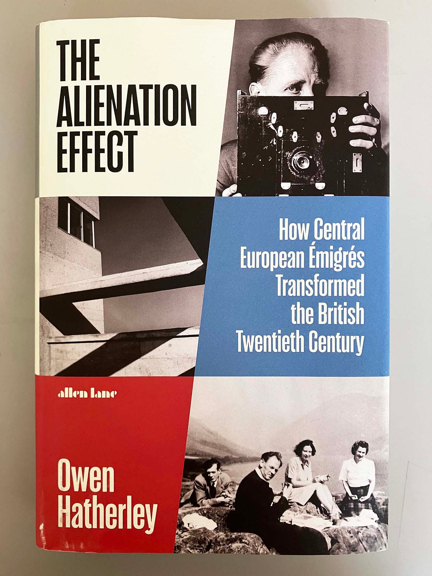
The alienation effect
How Central European émigrés transformed the British twentieth century
As Owen Hatherley writes in his acknowledgements pages, this book is a bit of a departure for him. In his prolific journalism and in his many books (15 or so, published over 16 years), Hatherley has until now written mostly on architecture and the built environment, with excursions into municipal politics, politics pure and simple, and pop music. His strongest suit is the critical evaluation of buildings, seen on tours to the places themselves, following in the tradition of Nikolaus Pevsner’s ‘Buildings of England’, and with Ian Nairn (1930–83) as the outstanding practitioner of the form at its most outspoken and polemical.
The alieniation effect is in part a work of synthesis of the by now large body of writing in English on its subject; but its most powerful passages are those in which Hatherley reports on what he has seen on his travels around Britain (here rightly named: Northern Ireland is not mentioned, but Wales and Scotland do get coverage). The fact that he has travelled and looked extensively in the Central/East European countries of the old Soviet bloc adds much freshness to this discussion. Just as he delights in describing the outer boroughs of London, and understands the special qualities of Welwyn Garden City and Stevenage, it feels as if he knows what he is talking about when he mentions Zlín or Łódź.
Hatherley’s approach is critical. He is emphatically socialist in his view of the world, and this politics informs his evaluation of the materials he discusses. In a nutshell, the book shows – successfully, though I have some reservations about his choice of sources – how the émigrés from Central Europe came to contribute to, and to enliven, everyday life and culture in Britain.
In a 50-page introduction, the scene is sketched: the events in Central Europe that led to the emigration, and the often less than warm welcome given in Britain to those that came here. Like several of us, Hatherley refers to the thesis advanced by Perry Anderson in ‘Components of the national culture’ (New Left Review, first series, no. 50, 1968): that the émigré intellectuals who settled in Britain were those who were comfortable in its climate of an anti-theoretical and effectively conservative empiricism; those who settled in the USA were radicals, able to deal with abstracted thought. So Britain got Karl Popper, the USA got (at least until 1949) Theodor Adorno. But Anderson was considering intellectuals – philosophers, sociologists, psychoanalysts and psychologists, historians. If one looks at art, architecture, cinema, graphic design, even literature, then the picture is different and more complex.
The first part of the book, on photography, photojournalism, and film, has some compelling instances. Discussing cinema, Hatherley blames the ‘auteur’ theory, with its elevation of the director of the studio film, for letting us miss the contribution of the émigrés, who in fact saturated the making of British films at every level, from the 1930s on into the 1970s. His suggestion is that the émigrés (for example the Hungarian scriptwriter Emeric Pressburger) infused British films with a quality of imagination and fantasy, brought from their backgrounds in the Weimar-German film industry, that had been missing from the rather dour native documentary habits. Many or most of the émigré photographers contributed to the perhaps defining publishing project of the period – the magazine Picture Post, founded by Stefan Lorant, Hungarian but working in Germany. Picture Post comes as a refrain through the book as one of the clearest, most successful instances of the effort of the democratic reshaping of mid-twentieth-century Britain: popular, intelligent, not patronizing.
‘Books and Buchkunst’ is the title of part two. Hatherley recounts the story of Penguin Books, starting business in 1935, and, in the design of its books, profoundly affected by a number of Continental designers. He prefaces this with an account of two Continental forerunners of the paperback idea: Tauchnitz and Albatross (which inspired Penguin in some obvious ways). Other subjects include the book-packaging firm of Adprint (full of émigrés at every level), the art-publishers Thames & Hudson and Phaidon. This is all now quite heavily analysed territory, and Hatherley’s talent for absorbing and recasting available histories shows itself in his learning from the published literature of the subject, faithfully credited in the end-notes. As for the primary evidence, it helps that books, unlike buildings, are small, made in many copies, and can often still be found in dusty second-hand shops.
It happens that two of the subjects of this part are people and phenomena on which I have done primary research and contemplated over 50 years. I will add some remarks about these cases towards the end of this piece.
In the third part of the book, Hatherley deals with the artists who came here. This is now well-travelled ground, but his treatment is not dull. As well as the long-celebrated figures – Kokoschka, Schwitters, Gabo, Mondrian, and so on – he is able to describe in reasonable detail the presence and contributions of figures that have only emerged quite recently in British art-historical consciousness, thanks to research. Thus Eva Frankfurther, who in 1939 arrived as a girl in London from Germany with her family, trained here at art school and went on to paint in a broadly social-realist manner the people she lived among in east London. Her subjects included another kind of émigré – those who had come here willingly from the colonies of the British Empire. Hatherley writes: ‘there was little that was abstracted or distorted, and few could have been shocked by her pictures, perhaps not even the British. But in them, much more than in the work of any of her contemporaries among the émigré painters, you can see a little glimpse of the future of London.’ (p. 281) In 1959, Frankfurther took her own life: one of several instances of later-in-life suicide in those with the trauma of the Nazi terror behind them.
Hatherley reaches his home ground of the built environment in the fourth part. His emphasis falls on social housing and urban planning, rather than on one-off houses for rich clients, and he has plenty of material to work with. The two large figures of Berthold Lubetkin and Ernő Goldfinger, both of whom arrived in Britain after spells of working in Paris, were thorough-going modernists, aesthetic and social radicals, who were glad to work on public architecture. Beyond these two, he picks out lesser-known architects of less celebrated buildings, as well as planners such as Konrad Smigielski in Leicester. This part ends with some pages on the work of Ruth Glass, who from a childhood and youth in Berlin came in 1935 to Britain, studying at the London School of Economics. As described by Hatherley, Glass was exceptionally open-minded, and empirical, in the best sense, in her work on cities. She too, like Eva Frankfurther, addressed ‘the newcomers: the West Indian migrants’ (the title of one of her books).
In his conclusion to the book, over 20 pages, Hatherley reminds us of the historicity of this subject: awareness and evaluations shift over time. What was prized 50 years ago may now be demoted in public awareness. He outlines the history of Bertolt Brecht, an anglophile (in some respects) who spent time in London in 1934 and 1936, but whose work remained little appreciated here until the 1960s and 1970s. The intellectualized pop music culture of the 1970s, which Hatherley refers to as evidence of ‘Weimar’ (in the 1920s) finally reaching Britain, feels to me too flimsy and ephemeral for anyone to make much of. Rather, his closing example, of Hans Feibusch’s huge murals at Newport Civic Centre (unknown to me before I read the book), does suggest the gift that the émigrés brought to the everyday life of the people of Britain. ‘It is that gift, and the ethic behind it, which we most need to rediscover today, before it’s too late.’ (p. 531)
A personal history
One could make a report on the history of this topic.1 But it may help to explain my criticisms of The alienation effect, along with my appreciation of it, if I sketch my own involvement with the phenomenon of the emigration from Central Europe. It began in 1971 when I joined the then young undergraduate course in Typography & Graphic Communication at the University of Reading (a ‘unit’, not yet a ‘department’). This had been established by Michael Twyman as a breakaway from the Fine Art department at the university. Michael was by then a senior lecturer, both a proficient artist and an art-historian with a PhD on the history of lithography, and he had done some freelance graphic design work. He had been taught at Reading by, among others, Leopold Ettlinger, who appears in The alienation effect as the Warburg-trained historian who co-wrote Compliments of the season (1947), the King Penguin volume devoted to an analysis of the British Christmas card. In this spirit, on the course at Reading we took printed ephemera seriously, as well as making field trips to Rome and Florence to study – with Warburgian curiosity – Classical and Renaissance lettering on buildings, tombs, paintings. We also learned to be typographers and went so far as to have lessons in typesetting on Monotype, Intertype, and the new IBM Selectric composing machines. This was the early 1970s. Things were opening up in Britain.
There were two émigrés on the staff at that time. I’m not quite sure what the lettercutter (or letter carver) Ralph Beyer – who has a brief mention in Hatherley’s book – actually taught, though in his weekly lessons he certainly imparted a sense of lost Central European culture. Ralph had been sent to England in 1937 by his father Oskar Beyer, the art historian and writer on (among others) Rudolf Koch and Erich Mendelsohn, and Ralph was an advocate of the work of both. He also stayed faithful to the memory of Eric Gill, with whom he was apprenticed soon after his arrival in England. But Ralph never adopted the Gill style of lettercutting; rather his work was Rudolf-Steinerish and German in spirit. I could never match Ralph’s own often mystical and anti-geometric lettering with his admiration for the suave precision that Mendelsohn’s work shows (after its early Expressionist phase).
Our other émigré teacher was Ernest Hoch, who had come from Vienna to England in 1938. As a designer Ernest, originally Ernst, was the opposite of Ralph – though both were genial men and got on well enough with each other. Ernest was analytical, a secular rationalist. Although by then his main projects were in standardization and especially in bringing international order to the chaos of typographic measurement, he had a career as a working graphic designer behind him. Among his clients had been the London borough of Haringey, and it was he who designed its centrifugal flash emblem (long-lasting but now discarded for a bit of populist nonsense).2
In 1971 Marie Neurath had closed down her Isotype Institute office in London and, with Michael Twyman recognizing the essential qualities of this body of work, given the contents to the University of Reading. In 1975, my last year as an undergraduate at Reading, I was one of the group of students that made the Isotype exhibition there (‘Graphic communication through Isotype’): celebrating the fiftieth anniversary of the Gesellschafts- und Wirtschaftsmuseum in Wien, and the first extensive public showing of this material. For me this was the beginning of an engagement that has never stopped, and one of its effects was to be drawn further into the world of the Central-European émigrés. I went on to do postgraduate research on Otto Neurath’s graphic work and was also employed – with the last money in the Isotype Institute’s bank account – to make a first catalogue of the collection.
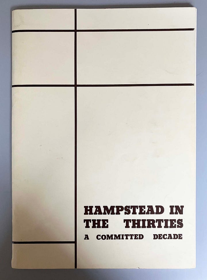
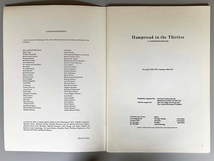
This was the time of the growing research into the phenomenon of the Central-European emigration to Britain. For example, in 1974–1975 the exhibition ‘Hampstead in the Thirties’ was shown at Camden Arts Centre and an informative and outreaching printed catalogue was made for it. At this time – the politically hot 1970s – a considerable effort of research was begun in Germany, under the rubric of Exilforschung. This had the motive of a coming-to-terms with the German past – a kind of exculpation, typically done by left-wing dissenters from the post-1945 West German social consensus, and making the attempt to recover culture that had been destroyed and driven out by the generation of their parents. I could understand this motive, though disagreed with the term ‘exile’, preferring ‘émigré’. An exile is someone who has been banished, but hopes to return. As Marie Neurath used to explain, she and all the others chose to leave, and most of them never thought of going back.
It may have been through Marie that in the early 1980s I met Cordula Frowein, who was one of the pioneer researchers in the field, writing articles and working on exhibitions, principally for the Jewish Museum in Frankfurt, and eventually completing a PhD dissertation (Bildende Künstler im Exil in Großbritannien 1938-1945, University of Frankfurt, 1993). By then she was back living in Frankfurt, but before this she had lived for a time in London with the émigré artist Gustav Metzger. Many of the émigrés were then still alive and could be found in the telephone directories of London or New York. Cordula had been to art school and could draw well; she was a determined researcher, whose talents were empirical rather than theoretical. Sometimes, when she was back in London on visits, we met up. I remember a visit with her to Brighton to look for books to buy cheaply and then sell on to upmarket dealers (‘book-running’), as a way to earn bits of money. Metzger would have taught her book-running: around then the bookseller Paul Breman (Dutch but living and working in London) told me that he had bought a copy from Metzger of the great ‘Atlas’ Gesellschaft und Wirtschaft (1930), made by Otto Neurath and his team in Vienna. In a downmarket shop in Brighton I watched Cordula identify from its spine and then buy one of the now rare books of the 1940s with a Lucien Freud illustration on its jacket cover.3
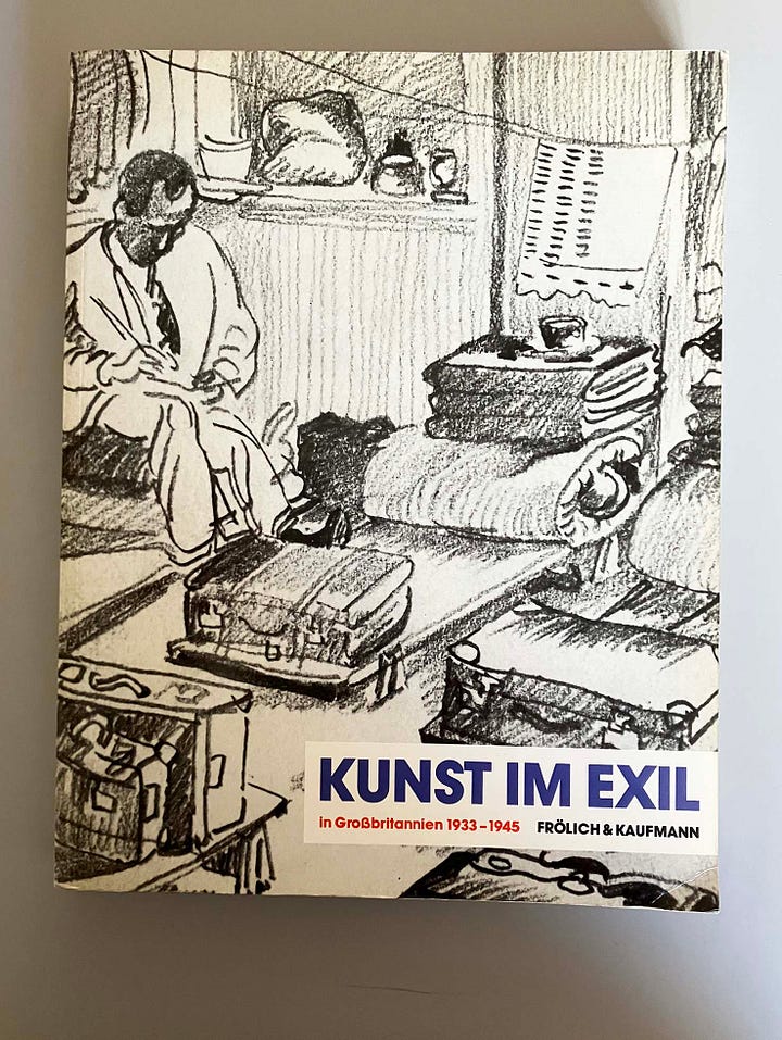
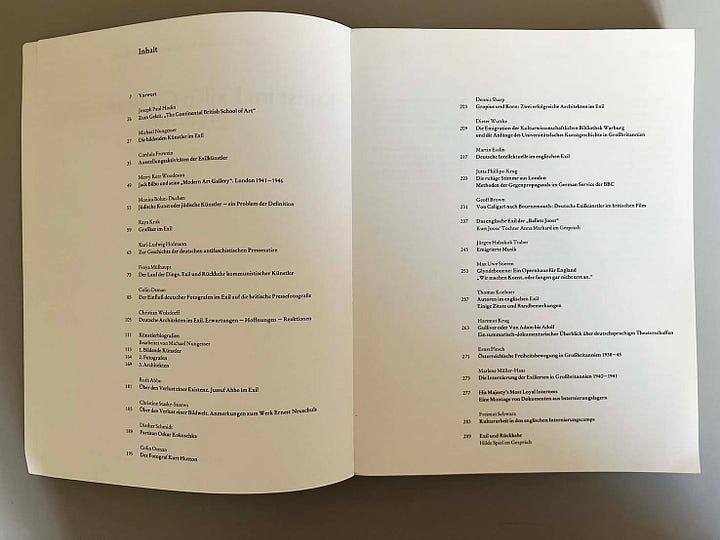
Metzger and Frowein were, I gathered, the main instigators of the seminal exhibition ‘Kunst im Exil in Großbritannien, 1933–1945’ – not mentioned in The alienation effect – which was shown in early 1986 by the Neue Gesellschaft für Bildende Kunst in West Berlin. A very impressive and still useful book/catalogue was made. Among the contributors to this book was Monica Bohm-Duchen, just then getting started as an art historian specializing in this field. Monica was the person deputed to bring the exhibition to London, and this she achieved successfully later in that year.
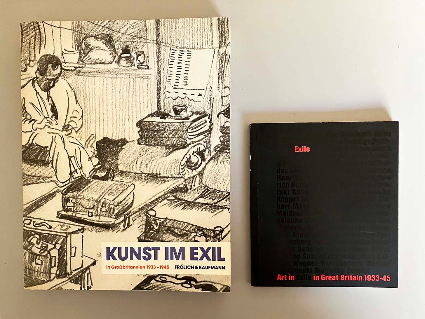
The show, in reduced form and with a highly condensed accompanying publication, opened at the perfectly situated Camden Arts Centre, where Arkwright Road joins Finchley Road: the epicentre of émigré north London. I was among those who gave talks at the exhibition, and spoke about the émigré graphic designers. All this now seems as a prelude to the ‘Insiders/Outsiders Festival’ project that Monica led in 2019. This comprised a substantial book, exhibitions, and talks (disrupted by the Covid pandemic, but then going online).
In the years following the London showing of ‘Kunst im Exil in Großbritannien’, the Central-European émigré phenomenon became an intermittent subject for me. In 1990 my essay ‘Emigré graphic designers in Britain: around the Second World War and afterwards’, developed from the Camden Arts Centre talk, was published in the Design History Journal. One impetus in my account was Perry Anderson’s thesis about the émigrés. I had encountered this in 1972, in its publication in the Penguin Special Student power (1969), and had increasingly begun to question it. Even in the visual or constructive arts, when one thinks of figures who went on from a stay in Britain to the USA, such as Walter Gropius or Lázló Moholy-Nagy, one sees that whatever radicalism they still had by the mid-1930s was being tamed and dispersed in its new cultural setting. In the prosperous American 1950s, the social motivation of these designers was further weakened. More positively, I wanted to point to the role of émigré graphic designers as consultants in large-scale commercial, sometimes state-supported work: F.H.K. Henrion, Hans Schleger, Willy de Majo, Lewis Woudhuysen, and indeed Ernest Hoch, would all be instances of this. I floated the suggestion that their superior educations and language skills would have eased them into these roles.
In 1997, I gave a talk at a symposium in Los Angeles, where at the Los Angeles County Museum of Art, the large show ‘Exiles + emigrés: the flight of European artists from Hitler’ was being exhibited. Eventually, in 2009, my text was published in Typography papers 8. My effort there had been to blur the categories somewhat, and to introduce the figure (which included myself) of the native British person who, for perhaps complex reasons, was attracted into the sphere of the émigrés in Britain. I also wanted to talk about the geography of emigration to London. And I was beginning to dislike the celebratory and too purely aesthetic tone of some of the commentary on and presentations of the émigré phenomenon, and wanted to point out that it also entailed depression, failure, and sometimes suicide.
Typography papers 8 was a special issue devoted to ‘Modern typography in Britain’. It’s a pity that Owen Hatherley seems not to have seen it, because it has much material that could have been important to The alienation effect. This publication started in conversations between the editor, Paul Stiff, and myself. We planned to reprint, but now with illustrations, the essay that Stuart Hall had written on Picture Post for Working Papers in Cultural Studies (no. 2, 1972). I scanned my copy of the original article to capture its words; Paul looked after the pictures – Reading University library had bought a complete set of Picture Post – and we got Stuart Hall’s permission to publish.
Typography papers 8 proved to be a culmination of the ‘Optimism of Modernity’ project that Paul Stiff, with the assistance of Petra Černe-Oven, had started at Reading in 2004. Paul explained its aims: ‘to tell the story of an incomplete and now almost forgotten project: that of modernity in British typography. This is envisaged as a matter not of style but of “design as a visible form of social philosophy” and as an optimistic claim on enlightenment.’4
Tschichold
The central designer in the Penguin Books story is Jan Tschichold, who in The alienation effect is counted as one of the émigrés in Britain. Hatherley is drawn to Tschichold’s youthful political and aesthetic radicalism in the Germany of the 1920s and early 1930s, and evidently wants to add him to the group of Central-European radicals who worked their way into everyday British life. In March 1933, with the Nazi seizure of power, Tschichold was detained in prison in Munich. After four weeks there he was released. In July, with his wife and young child, he left Germany for Switzerland, settling in Basel. As Christopher Burke reported, in what is much the best book on Tschichold, he did then cultivate some British contacts.5 He visited London in 1935 and 1937, and undertook some jobs for the English printer/publisher Lund Humphries. It seems that he was considering an emigration here. But nothing came of these contacts and enquiries, and Tschichold remained in Basel. One might suggest that his work was felt to be too radical, too foreign, for the British cultural climate, and there is evidence for this. But this is a complex matter, because it was partly his exposure to the British typographic culture of that time that encouraged his turn towards the ‘new traditionalism’ that he espoused from around 1938 onwards. Applicants for Swiss citizenship had to have 10 years of residence before being considered: Tschichold’s application was made in 1943, and by 1944 his new citizenship had been granted. His command of Swiss-German grew to be perfect.6
All this means that when in 1947 Tschichold came to work for Penguin Books, he was Swiss and was not seeking escape from Nazi Germany. He came to Harmondsworth, Middlesex, to do a job. This employment had been suggested to Allen Lane at Penguins by the English typographer Oliver Simon.7 In 1947, Tschichold was under no pressure to leave Switzerland, and he wouldn’t have taken this job but for Simon’s introduction. He stayed in England for just over two years, leaving after the British pound had been devalued (September 1949). He claimed that he could then no longer support his family with this work.
So I feel that the passages in The alienation effect on Tschichold need some adjustment. In the process, a slightly different picture of the foreigners at Penguin Books would emerge. Hatherley rightly counts Germano Facetti, the designer and commissioner of Penguin covers in the 1960s, as Milanese – so not Central European at all – but ‘who had done time in the Nazi concentration camp of Mauthausen’. One of Facetti’s British colleagues wrote that they used to speak German together, so thick was Facetti’s Italian accent when speaking English.8 Another essential, later Penguin contributor, Jerry Cinamon (not ‘Gerry’, as given in the book) was American, but with Jewish-European ancestry (I guess from the late nineteenth / early twentieth century emigrations to the USA). Though I never talked with him about this, it was something I could postulate: the older that Jerry got, the more East-European/Jewish he looked, and the more his interests in that part of the world flourished. In retirement he wrote books on the work of Rudolf Koch (2000) and Emil Rudolf Weiss (2012), and until his death last year worked on a dictionary of ‘German graphic designers during the Hitler period’. Imagined first as a book, it became a website.
In his discussion of Penguin Books, and in his comments on books throughout The alienation effect, Hatherley very largely stays with the covers. I could – and will – say that this is like evaluating buildings just by the facades, with no thought of trying to get inside and have a look round. In my view the glory of the design of Penguin’s ‘Buildings of England’ series, for example, is not in their nice but forgettable covers, but rather in their very openable well-bound book-blocks, the tough cover material of the hardbacks, in the soft and delicate photogravure reproduction of photographs, and in the beautifully articulate visual coding of the textual elements: small capitals, italics, cross references placed in the outer margins. Pevsner’s action-packed, super-compressed prose was processed by the firm’s editors, who worked hand-in-hand with their designer Hans Schmoller (who although he spent the war years in Africa can be counted as a real émigré from Nazi Germany). These books are triumphs of humane, pleasurable information design.
In his sources for these pages on Tschichold at Penguin Books, Hatherley cites Richard Doubleday’s book Jan Tschichold, designer: the Penguin years (2006). This was an obvious piece of book-making, full of mistakes, without an original idea in its head, and best forgotten. More generally, it’s a shame that Tschichold has been so badly served in English-language publication. The two books of his that Hatherley cites and compares – Asymmetric typography (1967) and The form of the book (1991) – are misleading productions, as one can see immediately if one puts them next to their German-language source editions.
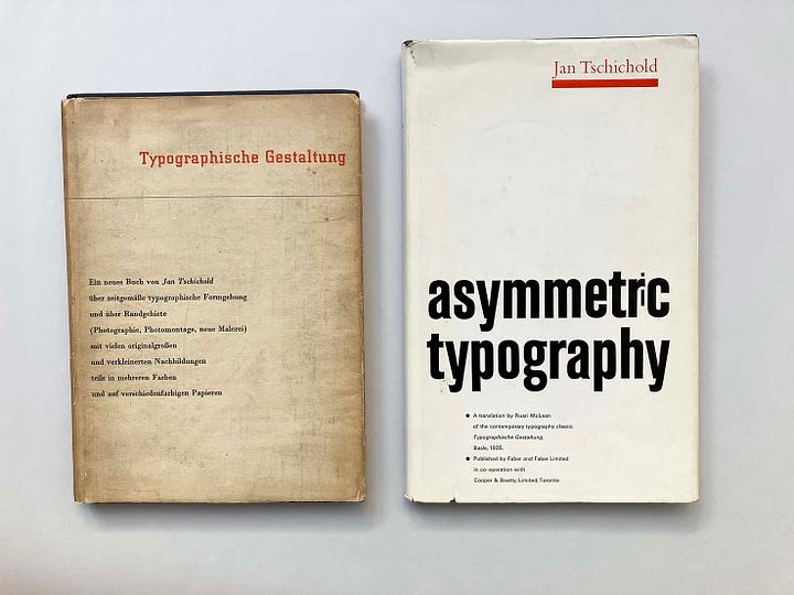
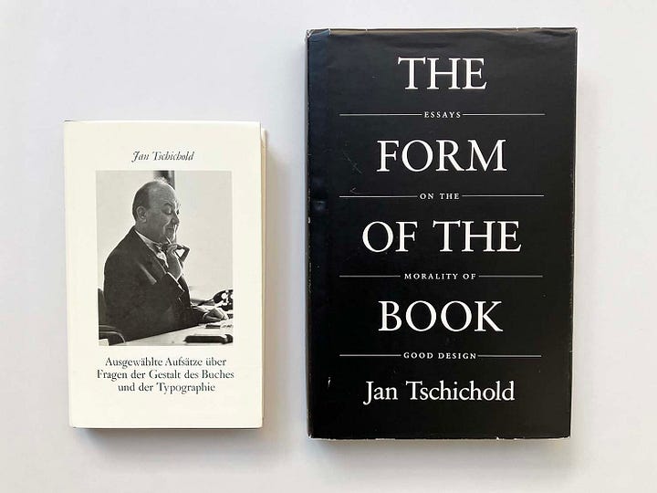
Tschichold was an object-maker. Although authoritarian in his pronouncements, his own design work, even in his most standardizing years, was full of surprises and even fantasy. The English-language publishers who have put out books by and about him have a near-impossible task, and most of them have failed at the first hurdle of paper quality and binding.
I can make a similar complaint about some of the sources used for the book’s account of Otto and Marie Neurath’s work in Britain. Hatherley commends Nader Vossoughian’s Otto Neurath and the global polis (2011) as ‘a good synoptic account of Isotype’. It’s true that this book uses many good photographs of relevant material, but its annotation and interpretation of this material is often mistaken; I think its central thesis is overplayed too.9
I don’t know where Hatherley’s account of the Neuraths’ escape to England comes from (they ‘landed on the sands of Kent on a raft’). This is wonderfully romantic nonsense. The truth is that they left Scheveningen (The Hague’s port) on a motor-powered lifeboat, the Zeemanshoop, with more than 40 others, were picked up the next day by a British destroyer, HMS Venomous, which took them to Dover – and immediate internment.
More generally with the Isotype work, as with his evaluations of typographic work, Hatherley doesn’t quite have the language to articulate what he is seeing. There may be no shame in this. The history of Otto Neurath’s work in visual communication – which was always a team effort made by several people, and which was disrupted twice by sudden emigrations – is especially liable to distortion in rapid summaries such as these. And, regarding typography and book design, perhaps it takes some years of practice in typesetting and print production to be able to write about it with any explanatory force.
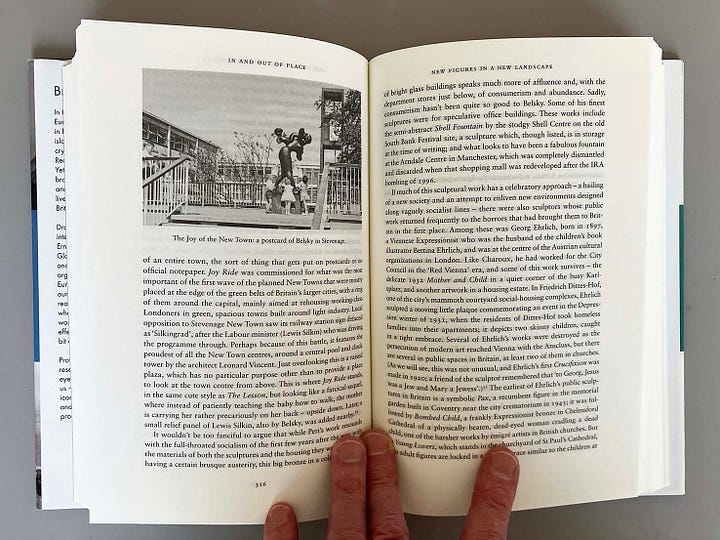
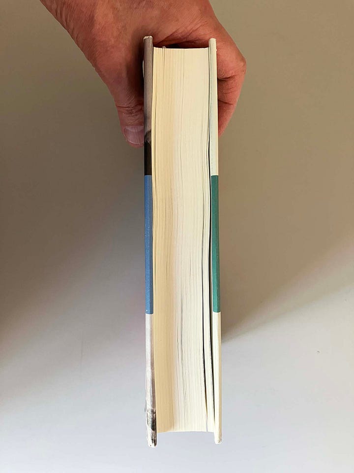
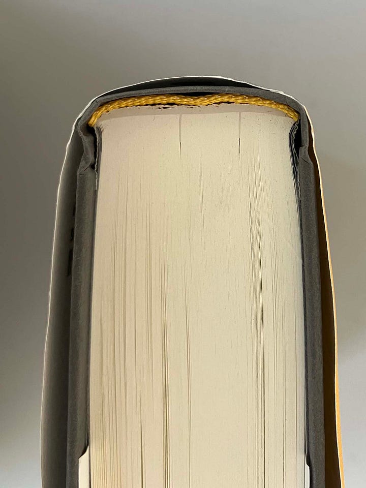
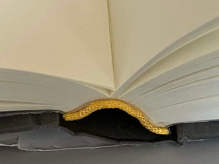
In its design and production, The alienation effect largely follows the style of present-day Penguin Random House hardbacks: typeset in the typeface Sabon (but thankfully not in any explicit homage to Jan Tschichold, its designer) and printed and bound by Clays / Elcograf (discussed here).10 After a thorough reading of every page, some of them are beginning to come out of the book-block. The pages are perfect-bound with a thick layer of quite flexible adhesive. Disguise is the only function of head- and tailbands in industrial book production; here they fail in that job.
Owen Hatherley, The alienation effect: how Central European émigrés transformed the British twentieth century, London: Allen Lane, 2025. (£35)
See, for example, Jutta Vinzent, Identity and image: refugee artists from Nazi Germany in Britain, 1933–1945, Weimar: VDG, 2006, pp. 10–19.
See the thorough and impassioned article by Paul Stiff and Petra Černe Oven, ‘Ernest Hoch and reasoning in typography, Typography papers, no. 8, pp. 151–71. The Haringey emblem is not mentioned, but I have a clear memory of Ernest showing our class of students this and other pieces of his design work.
I lost touch with Cordula in the 1990s. Years later I talked about her with Nick Jacobs, whom I had got to know initially through the subject of the émigrés, and with which he was engaged for most of his adult life (see here). He had also known Cordula in London and had stayed in touch, visiting her in Germany shortly before she died. I’m pleased to see Nick’s co-written Bertolt Brecht in Britain (1977) cited as a source by Hatherley (p. 575).
See here. Paul was working on through throat cancer in those years and he died in 2011. The ‘Optimism of Modernity’ project was never properly concluded, but its website remains for the time being.
Christopher Burke, Active literature: Jan Tschichold and new typography, London: Hyphen Press, 2007, pp. 272–83.
In 1965, Max Frisch and his (then) wife Marianne Oellers, who was German, came to live next door to Jan and Edith Tschichold in Berzona, Ticino. After Tschichold’s death Frisch remembered: ‘Sie sprechen die Mundart; nur wenn wir, Marianne zuliebe, Schrift-deutsch sprechen, so ist zu hören, daß Jan Tschichold nicht als Schweizer geboren worden ist. Sein Verhältnis zu diesem Land, das er als Emigrant gewählt hat als zeite Heimat: nicht unkritisch, doch generös, mehr als nur fair.’ [‘They [Jan and Edith Tschichold] speak the dialect; only when we, to please Marianne, speak high German, can one hear that Jan Tschichold was not a born-and-bred Swiss. His relationship to this country, which he chose as an emigrant to be his second Heimat: not uncritical, yet generous, more than just fair.’] (Max Frisch, ‘Jan Tschichold als Nachbar’, in: Philipp Luidl (ed.), J.T.: Johannes Tzschichhold, Iwan Tschichold, Jan Tschichold, Munich: Typographische Gesellschaft München, 1976, pp. 81–5, at p. 82.)
Simon was a perhaps unique figure in the British typographic scene. Jewish on both parental sides and the son of a cotton merchant in Manchester, who had published a monograph on Heinrich Heine, as a boy he had spent four years in a boarding school in Jena. After 1918 he travelled to Germany making significant contacts with people in the German printing businesses. (See Simon’s autobiography: Printer and playground, London: Faber & Faber, 1956.)
This was the same Nick Jacobs, mentioned in note 3 above.
See my review here. The best single book on the subject is now this: Christopher Burke, Eric Kindel, Sue Walker (ed.), Isotype: design and contexts, 1925–1971, London: Hyphen Press, 2013. Christoper Burke has gone on to co-write these very useful works: with Günther Sandner, History and legacy of Isotype, London: Bloomsbury, 2024; and with Adam Tamas Tuboly, Otto Neurath in Britain, Cambridge: Cambridge University Press, 2025.
Sabon was commissioned by three firms: the typefounder Stempel, and the Linotype and Monotype composing machine firms. They had a specific condition: that its forms should be the same for all three composition systems. One can see the result most clearly in the lowercase italic ‘f’, which is inevitably and unnaturally compressed in its form. To adapt the typeface for use in the non-metal systems that we now use, and retain these specially constricted forms, doesn’t make sense. Incidentally, the book cited in note 6 above is set in a metal version of Sabon, either Linotype or Monotype. It is a rare production made in Tschichold’s honour that lives up to his own standards.

